
Some grocery stores feel effortless from the moment you walk in.
You know roughly where everything is. The layout makes sense. You can find what you need without doubling back three times or asking someone where the pasta is. The whole trip moves at a pace that fits your day instead of working against it.
Other stores feel like the opposite of that, even when they carry everything you need. The layout is confusing, signage is unhelpful, and a quick stop somehow turns into twenty minutes of unnecessary walking.
The difference between those two experiences almost always comes down to how thoughtfully the store was designed and how consistently it is maintained. For anyone doing regular shopping at a grocery store in Fort Lauderdale, FL, that difference matters more than most people realize until they find a store that actually gets it right.
Here is a closer look at what separates stores that are easy to shop from stores that are not.
Why Store Layout Affects More Than Just Convenience
It is easy to think of store navigation as a minor comfort issue. It is actually something that affects your budget, your time, and your stress level in ways that add up over many shopping trips.
A store that is hard to navigate tends to produce more impulse purchases, because shoppers wander past things they were not looking for. It also produces more forgotten items, because the mental effort of navigating takes attention away from the actual list. And it takes more time, which matters whether you are doing a full weekly shop or stopping in quickly on a busy weekday.
A well-designed layout works the other way. It reduces the friction between you and what you came in to get. It makes the shopping experience feel manageable rather than like a task to push through. Over time, that difference is one of the biggest reasons certain stores become part of a household’s regular routine while others stay as occasional backup options.
In Fort Lauderdale, where many shoppers are balancing busy schedules and warm weather that makes lingering in a parking lot less appealing, a store that respects your time through good layout design has a real practical advantage.
A Logical Flow Through the Store Matters from the Start
The first thing shoppers encounter sets the tone for everything that follows.
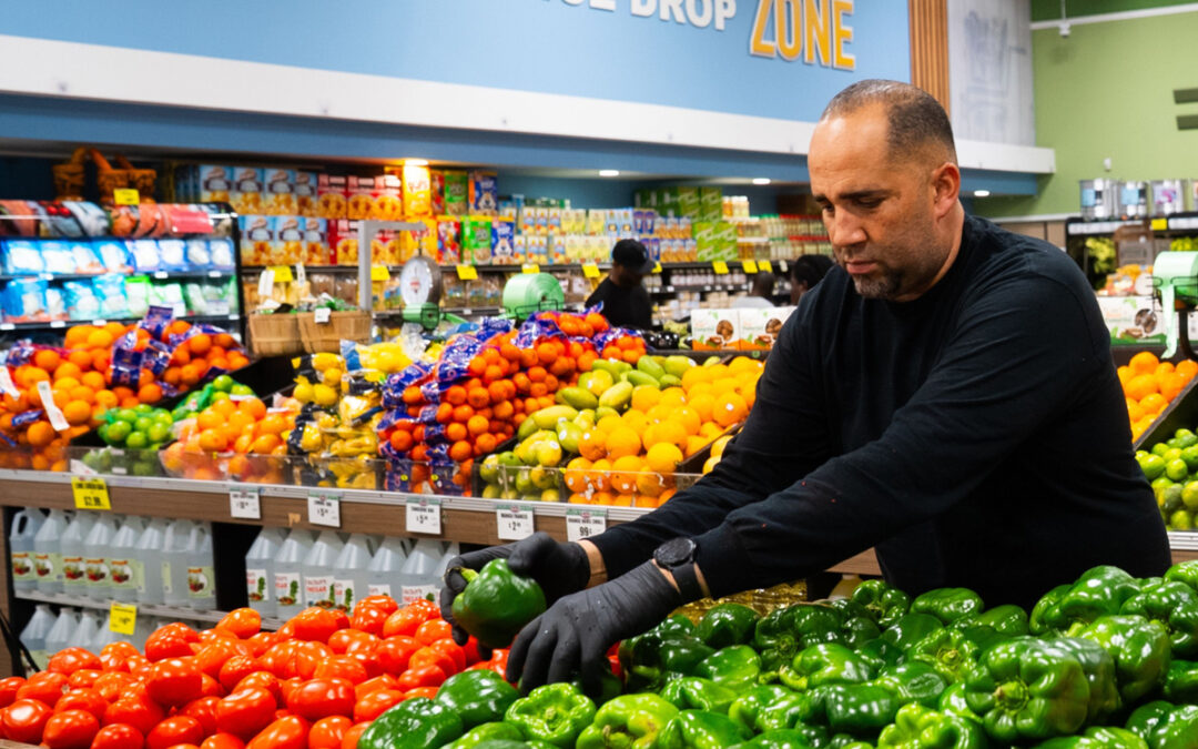
Most well-designed grocery stores open into the produce section. This is not accidental. Fresh fruits and vegetables are visually appealing and signal freshness to the shopper immediately. Starting with produce also means that the most perishable items go into the cart first, which is useful for shopping efficiency even if most people do not think about it consciously.
From produce, a logical store flow tends to move shoppers through fresh departments like bakery and deli before reaching the center aisles where shelf-stable items live. Refrigerated sections typically run along the perimeter, which keeps cold items grouped and reduces the distance shoppers have to travel to find them.
When this flow is designed well, a shopper moving through the store in a natural path will cover most of what they need without significant backtracking. When it is designed poorly, the same shopper ends up crisscrossing the store repeatedly, which adds time and effort to every trip.
For a grocery store in Fort Lauderdale, FL serving a community that shops regularly and often on tight schedules, getting this foundational flow right is one of the most important things a store can do for its customers.
Aisle Organization Makes or Breaks the Center of the Store
The center aisles of any grocery store are where navigation either works or falls apart.
Good aisle organization supermarket design follows a logic that shoppers can learn quickly and rely on consistently. Related items are grouped together. Categories are predictable. If you found something in a certain spot last week, it is in the same spot this week.
That last point is more important than it sounds. One of the fastest ways a store loses shopper goodwill is by reorganizing product placement frequently without clear logic. Shoppers who have learned a store’s layout develop a kind of mental map that makes each visit faster. Disrupt that map without good reason and every regular customer has to relearn the store from scratch.
Strong aisle organization also means that categories are grouped in ways that reflect how people actually cook and shop, not just how products are distributed by brand or supplier. Pasta and pasta sauces together. Baking items in one place rather than split across multiple aisles. Breakfast items grouped in a way that makes sense for someone building a morning meal rather than scattered based on product type alone.
In a well-organized grocery store, shoppers stop having to think so hard about where things are and start spending that mental energy on what they actually want to cook.
Clear Signage Reduces Friction Throughout the Trip
Even in a well-organized store, signage does significant work.
Aisle markers that are visible from a distance, clearly labeled, and updated when product placement changes make a store navigable for both regulars who know it well and first-time visitors trying to get oriented quickly.
In Fort Lauderdale, where grocery stores serve a diverse community that includes long-term residents, seasonal visitors, and newcomers to the area, signage that is easy to read and genuinely helpful serves a wider range of shoppers than stores might sometimes account for.
Good signage also extends beyond aisle markers. Clear pricing labels that are easy to match to the correct product reduce the guesswork and frustration that comes from picking up an item and not being sure what it costs. Department labels that help shoppers find the deli, bakery, or seafood counter without having to scan the whole store are part of the same customer-friendly layout philosophy.
Signage that is missing, outdated, or too small to read from a reasonable distance is a small thing individually but adds up to a noticeable source of friction across a full shopping trip.
The Perimeter Layout and Why It Works for Everyday Shoppers
Most grocery stores are built around the idea that the perimeter of the store handles fresh and perishable categories while the interior handles shelf-stable goods. When this structure is followed consistently, it creates a predictable geography that shoppers can use as a reliable mental framework.
For everyday shoppers in Fort Lauderdale building meals around fresh ingredients, the perimeter is often where most of a trip is spent. Produce, meat and seafood, dairy, and deli items all tend to live along the outer walls of the store. Being able to move through those sections efficiently, without having to dip into the center aisles more than necessary, is a significant convenience on trips where fresh food is the primary focus.
Stores that blur this structure, putting refrigerated items in the center aisles without clear organization or spreading fresh categories around the store without a consistent logic, tend to feel harder to shop even when the product selection is strong.
The perimeter layout works because it gives shoppers a reliable mental model they can apply every time they walk in. That consistency is a core part of what makes an easy shopping experience feel easy rather than effortful.
Checkout Layout Is Part of the Navigation Experience Too
Navigation does not end when a shopper finds everything on the list. The checkout experience is the final leg of the trip, and a poorly designed checkout area can undo a lot of the goodwill built by a well-organized store.
Checkout areas that are easy to find and clearly marked for the number of items they accept make the end of the trip feel smooth. Lanes that move at a reasonable pace, a clear distinction between full-service and self-checkout options, and enough open registers during busy periods all contribute to a finish that feels proportionate to the rest of the shopping experience.
For shoppers at a grocery store in Fort Lauderdale, FL who are stopping in after work or squeezing a trip into a busy afternoon, the checkout area is the last impression the store leaves. A checkout experience that feels backed up, confusing, or poorly staffed leaves people remembering the frustration more than they remember the well-organized aisles they moved through ten minutes earlier.
Stores that treat checkout layout as part of the overall navigation design, rather than a separate operational concern, tend to deliver a consistently better end-to-end experience.
How Store Maintenance Affects Navigation Over Time
A well-designed layout only stays navigable if it is consistently maintained.
Aisles blocked by stocking carts during peak shopping hours, shelves that are partially empty without any indication of when product will be restocked, refrigerated cases left open, and displays that have shifted from their intended positions all chip away at the navigability of even a well-planned store.
In Fort Lauderdale, where grocery stores often see consistent traffic throughout the day due to the city’s mix of working residents, retirees, and visitors, maintaining a store’s layout and organization during busy periods is an ongoing operational discipline rather than something that can be set up once and left alone.
Shoppers who have found a store they like will forgive occasional disruptions. They are less forgiving when disorganization feels like the norm rather than the exception. Consistent maintenance of aisles, signage, and product placement is what separates a store that earns long-term loyalty from one that shoppers visit when nothing better is available.
What to Look for When Choosing a Store Based on Layout
If you are evaluating a grocery store in Fort Lauderdale, FL based on how easy it is to shop, a few things are worth paying attention to on your first visit.
Notice how the store opens. A clear, welcoming entrance that orients you quickly is a good early sign. Walk through the produce section and pay attention to how it flows into the rest of the store. See if the aisle organization makes immediate sense or requires significant adjustment.
Look at the signage from a normal walking distance. Can you read aisle markers without stopping and squinting? Are prices clearly labeled and easy to match to the correct product?
Notice how the perimeter is organized. Can you find the main fresh departments without a full loop of the store?
Finally, note how the checkout area feels. Is it clearly organized? Does it seem like it would move reasonably well during a busy time of day?
A store that handles all of those well on a first visit is almost always one that will continue to feel easy to shop over many visits.
Shop Easier at Key Food Lauderhill
At Key Food Lauderhill, the layout is designed around making everyday shopping straightforward. From a produce section that orientates you from the start to clearly organized aisles, fresh departments along the perimeter, and a checkout experience built for efficiency, every part of the store is set up to make your trip easier.
Whether you are doing a full weekly shop or stopping in for a few items, come see how a well-organized neighborhood grocery store can make a real difference in your routine.
FAQs
Why does grocery store layout matter for everyday shoppers?
A well-designed layout reduces the time and effort each trip takes. It minimizes backtracking, makes it easier to find what you need, and creates a shopping experience that fits into a busy day rather than disrupting it.
What is the best layout for a grocery store?
Most effective grocery store layouts follow a perimeter-fresh, center-shelf-stable structure with a logical flow from produce through fresh departments before reaching center aisles. Clear aisle organization and visible signage reinforce that structure for shoppers.
How does aisle organization affect the shopping experience?
Good aisle organization groups related items in ways that reflect how people actually cook and shop. When products are placed predictably and logically, shoppers spend less mental effort finding things and more attention on what they actually need.
What should I look for in a customer-friendly layout when trying a new store?
Pay attention to how the store opens, whether signage is visible and accurate, how the perimeter departments are organized, and how the checkout area is set up. A store that handles all of these well on a first visit will usually continue to feel easy to shop on repeat visits.
Why do some grocery stores feel harder to navigate even when they carry everything? Layout design and maintenance are the usual culprits. A store can have strong product selection but still feel frustrating if the layout lacks logical flow, signage is poor, or aisles are frequently disrupted by stocking activity during shopping hours.
How does consistent store maintenance affect navigation?
Even a well-designed layout deteriorates quickly without consistent upkeep. Blocked aisles, missing signage, and shifted product placement all reduce navigability over time. Stores that maintain their layout actively tend to feel easier to shop on every visit, not just the first one.